
University of Illinois - Gies College of Business
A dynamic digital experience for one of the world’s most dynamic online business schools.

As a critical component of Gies College of Business’ strategic priorities including access, inclusion, and innovation, the Gies Online experience needed a complete overhaul.
Role
UX Lead
Activities
In-depth interviews - competitive analysis - tech stack discovery - information architecture - wireframes - usability testing analysis
The Challenge
Consolidate all Gies Online domains into one overarching hub that will serve as a catalog of all online programming and help the organization secure its leadership in the space through seamless UX, unified branding and consistent messaging.
The Process
Understanding the what
Gies Online’s digital ecosystem was made up of six different sites belonging to the University of Illinois, as well as dedicated sub-domains via Thinkific, SamCart, and Coursera. Programs and courses were spread between all of these locations as well as through downloadable PDFs. In order to tackle the feat of consolidation into one overarching hub, we first needed to conduct an in-depth audit of all existing content to understand what we were dealing with.
As part of this discovery phase, we conducted multiple in-depth interviews with stakeholders ranging from marketing managers, to educational content professionals, to project coordinators, to developers, in order to learn both the ins and outs of program structure, as well as the parameters we were constrained to in terms of building the new site within the same back-end as the rest of the University of Illinois digital properties.


Gies Online’s main value proposition is its flexibility, toting “stackable” courses that students can take individually, or combine together to earn a certificate, a specialization, all the way up to a full master’s degree. Because of this, it was important that we first identify all existing courses, then figure out exactly how they stack — which degree tracks, certificate programs and specializations they were also a part of so we could build a course catalogue that would accurately represent all of the many flexible learning options.

Defining the who
As an educational institute with so many different learning tracks, it was very important to understand the various audiences to which each track was designed. To learn more about our audience, we conducted in-depth interviews with Gies’ marketing and sales teams as well as did a deep dive into the various Gies Google Analytics dashboards. The result? Our three personas:
Prospective degree students
Prospective non-degree students
Current students


Organizing the new experience through site-mapping
Gies Online’s sitemap was a BEAST. First, we conducted site crawls of all existing web properties. We then combed through URLs and categorized them into different buckets:
General pages (about, careers, contact, etc.)
Program pages (curriculum, degree requirements, program overview, etc.)
Admissions pages (FAQs, how to apply, tuition)
Archive & posts (Blogs, team, news & events, courses)
Current students (academic advising, course planning, career services, etc.)
We then thought back on the organization’s goals for the site:
Clearly showcase the flexibility of Gies Online and all of the various learning tracks it offered.
Give degree programs more prominence as they ultimately bring in the most revenue.
Highlight Gies’ main differentiators showing that it’s more than just an online university, but offers in-person programming and engagement opportunities.
Provide the right information necessary for different personas to confidently choose the learning track with them.
This information, reconciled with existing content, brought us to our final sitemap of a mere 313 pages (not including blog, news or event posts!).

Structuring key pages through information architecture & wireframing
We focused on our efforts on high-profile pages that would work towards accomplishing the goals of the project, and of course, the navigation. These pages included:
Homepage
Degree archive & posts
Course catalog, taxonomy & posts
Why Gies
Contact
News/events archive & posts
Some considerations to call out:

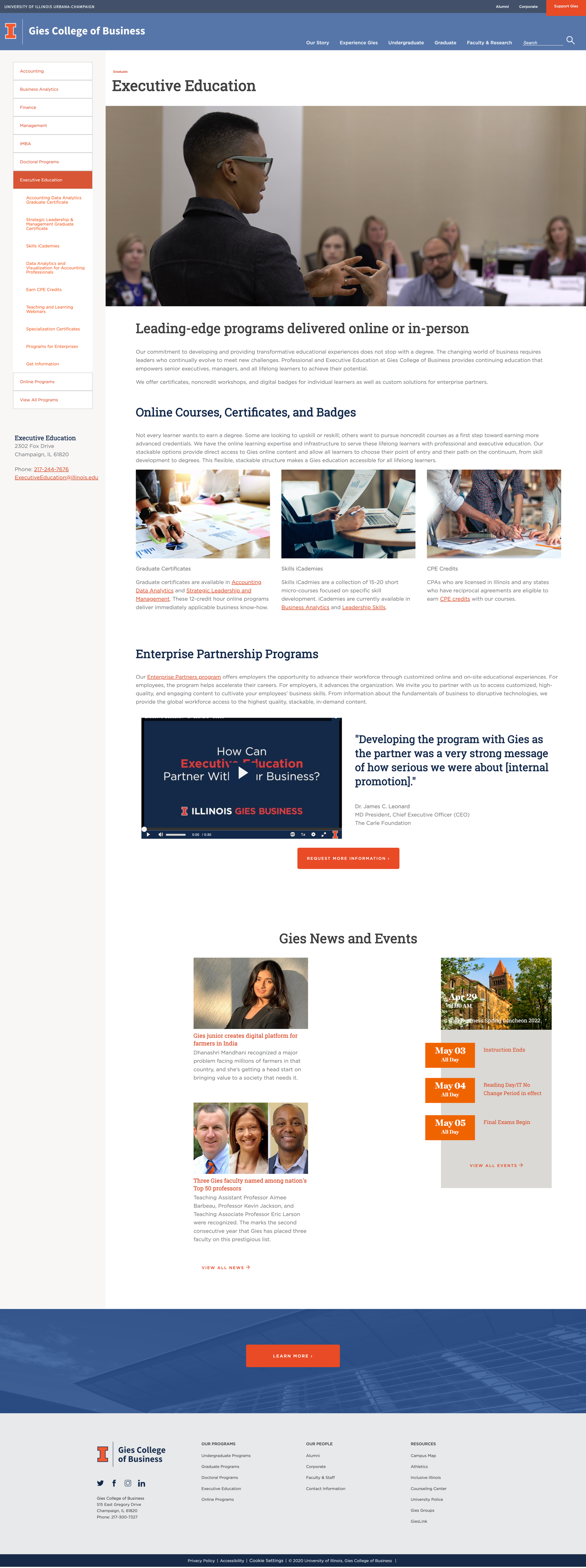
HOMEPAGE: We included a hero navigation that works to both immediately communicate Gies’ range of learning tracks, as well as make it easy for users to navigate to the one that aligns with their goals.

COURSE CATALOG: We broke the catalog page up into a ‘featured’ section, for someone to immediately explore all courses belonging to a specific learning track, as well as the full catalog that allows users to filter by learning track (ex. iMBA vs. certificate), subject matter (ex. Digital Marketing vs. Business Analytics), and learning type (ex. self-paced vs. for-credit).

HOMEPAGE: In terms of information hierarchy, we chose to feature News & Events higher up to immediately dispel the notion that Gies Online is a static, digital-only organization, & instead make it feel current & engaging.
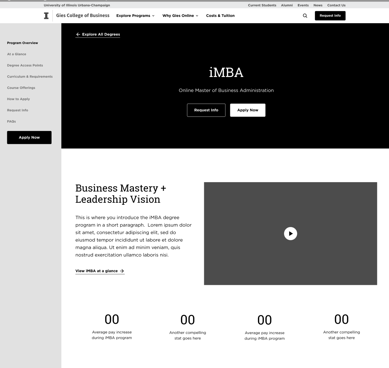
DEGREE PROFILE: We included a sidebar navigation for users to easily jump to the information they seek within their degree of interest, rather than having them navigate a convoluted sitewide mega navigation.
Testing & iterating for usability.
The Gies team conducted 3 rounds of usability testing whereby we analyzed the results and made strategic updates based on what we found. Reoccurring feedback included users:
Being overwhelmed by the many different learning tracks and needing an option to compare and explore all offerings in one place.
Not understanding the “stackable” concept of how courses can build on each other.
Wanting to more clearly get a taste for the subjects offered, vs. just the format in which they’re offered.
Not immediately understanding the connection between Gies Online & University of Illinois.
Not easily finding information on cost, duration and learning expectations.

UPDATE: We included an “Explore my Options” link in the hero navigation for those who feel overwhelmed by the offering. We also wove ‘University of Illinois’ in the below-hero headline to reinforce the relationship.

UPDATE: We created an ‘Explore all Programs’ page that listed each learning track, as well as the specific programs available under that track.

UPDATE: We swapped the hierarchy between learning format and subject matter by showcasing more teasers of courses offered and less information on format on high-level pages.

UPDATE: We made program cards more scannable with the key information users are looking for - duration, format and and cost.
The Outcome
Gies Online’s new site boldly communicates the organization’s unique flexible product offering while ensuring users can easily digest, filter through and ask questions about the offering, as well as take the various necessary next steps towards enrolling.


Learnings & improvements for next time
Based on our usability testing results, if more time allowed, it would have been helpful to conduct further initial research to discover what information our different personas initially look for when researching courses and programs, and how they consume this information.
To eliminate questions and hypothetical discussion around pages not yet designed, because of the nature of Gies Online’s stackable offering and how each learning track can truly fit together with one another, I would have chosen to wire out all pages together, vs. in small batches.